2024 April
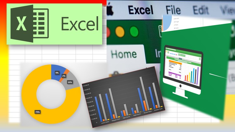
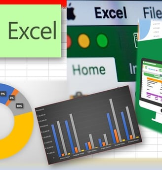
Excel for Data Analysis: A Guide Beyond the Basics

Formulas and Functions: The Building Blocks of Analysis
Excel is home to a vast library of formulas and functions, each designed to tackle different types of tasks—from simple calculations to complex analysis.
Essential Functions for Data Analysts
VLOOKUP/HLOOKUP: Search for a value in a table and return information from a corresponding cell.
INDEX MATCH: A powerful alternative to VLOOKUP, allowing more flexibility in retrieving data.
SUMIF/SUMIFS, COUNTIF/COUNTIFS: Summarize or count data based on one or multiple criteria.
Dynamic Arrays: A Game Changer
Introduced in recent versions of Excel, dynamic arrays allow formulas to return multiple values that automatically spill over into neighboring cells. This feature significantly simplifies and enhances data manipulation and analysis.
The Power of PivotTables: Simplify Complex Data
PivotTables are Excel’s crown jewels when it comes to data analysis. They allow you to summarize large datasets in digestible formats without altering your original data.
Getting Started with PivotTables
Select your data range
Navigate to Insert > PivotTable
Choose where you want the PivotTable report to be placed
Drag and drop fields to create your report
Advanced PivotTable Techniques
Calculated Fields: Add your own formulas within a PivotTable to analyze custom metrics.
Slicer and Timeline Tools: These tools act as interactive filters for your PivotTable, making it easier to slice through dates and categories.
PivotTables turn extensive data into accessible insights, making them indispensable for anyone looking to analyze trends and patterns.

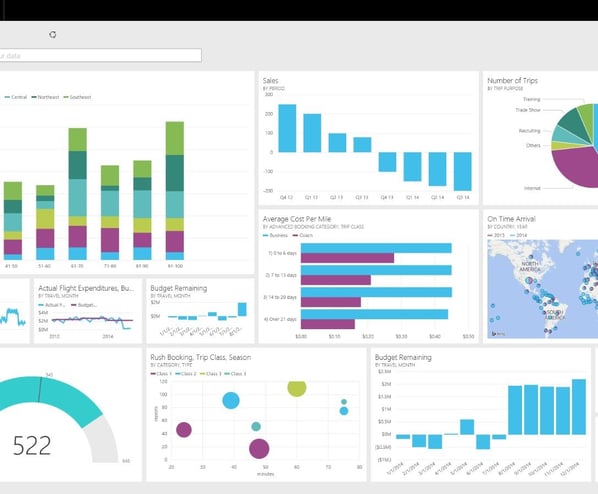
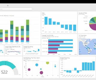
Data Visualization: Telling Stories with Charts
A compelling narrative often requires more than just numbers and text. Excel’s data visualization tools help translate data into a story through charts and graphs.
Types of Charts for Data Analysis
Line Charts: Ideal for showing trends over time.
Bar Charts: Best for comparing quantities of different categories.
Pie Charts: Useful for showing proportions within a whole.
Advanced Visualization Techniques
Conditional Formatting: Highlight or color-code your data based on specific conditions.
Dashboards: A collection of tables, charts, and metrics that provide an overview of the data and insights.
Visualizations make complex data understandable at a glance and are crucial for effective data analysis.
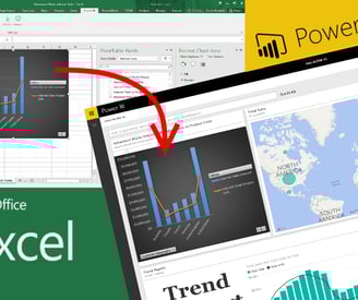
Beyond Basics: Power Query and Power Pivot
For those looking to push Excel's boundaries, Power Query and Power Pivot offer advanced data modeling and analysis capabilities.
Power Query: Data Preparation Made Easy
Import data from various sources (web, databases, other files)
Clean, transform, and prepare data without formulas
Power Pivot: Powerful Data Modeling
Create complex models with large datasets
Use Data Analysis Expressions (DAX) for advanced calculations
These tools enhance Excel’s capacity to handle big data, making it competitive with specialized data analysis software.
Conclusion:
Excel for data analysis is like a Swiss Army knife—packed with tools for nearly every need. Starting with PivotTables, mastering essential formulas, visualizing data, and embracing Power Query and Power Pivot; this guide aims to equip you with the skills to turn data into decisions. Remember, the key to Excel mastery is practice and curiosity. Dive into datasets, experiment with tools, and always be on the lookout for that next insight. Your data analysis journey is bound to be filled with discoveries and triumphs. Happy analyzing!
"In God we trust; all others must bring data." – W. Edwards Deming
This guide only scratches the surface of what’s possible with Excel for data analysis. For further exploration, consider diving into specific courses or tutorials that focus on areas like dynamic arrays, DAX for Power Pivot, or advanced visualization techniques. There’s a universe of data out there waiting to be understood, and Excel is your telescope.
Tip for Excel
Tip for Excel